I often solve equations of the form f(x) = g(x) by graphing y = f(x) and y = g(x) on the Cartesian plane and looking for any points of intersection. The Sine of the Times blog shows a way to investigate these equations without jumping to a second dimension and introducing y. The post is well worth a read.
mathfest
Thursday, June 2, 2022
Friday, October 26, 2018
The Orthocircle. Who knew?
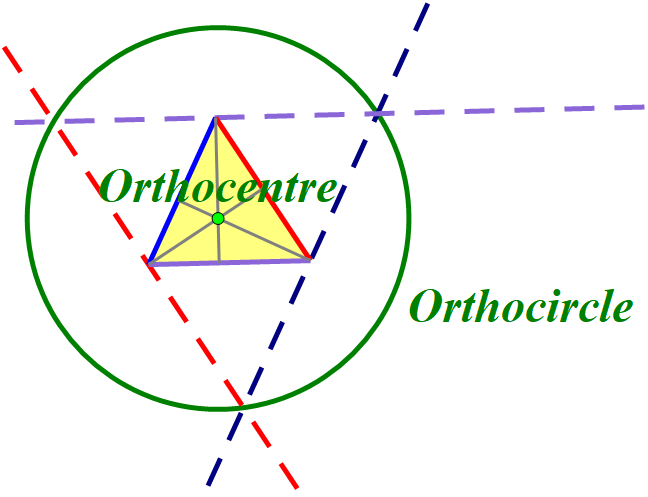
I have been writing some support materials for the yet to be released Pattern Blocks+ mathies tool. I received feedback that many elementary teachers would not be familiar with the term "altitude", much less "orthocentre". It occured to me, that I knew about the incentre and incircle, the circumcentre and circumcircle, but couldn't recall ever constructing an orthocircle.
I read Math is Fun's Triangle Centers page and loved the visuals and interactive sketches, but they did not include an orthocircle. The page says that there are actually thousands of "centres" of a triangle, and I wonder if "interior points" was what was meant.
After a little more surfing, I wrote the following:
The three altitudes of a triangle always intersect in a single point called the orthocentre of the triangle. This point is the centre of a circle that can be constructed by creating a triangle with sides parallel to the original triangle through its vertices (see below).
It was nice to dust off The Geometer's Sketchpad again.
Is the orthocircle as new to you as it was to me?
Is what I have written accurate or is it better to say that this is one of many orthocircles?
My 11th blog anniversary went by on the 23rd.
Labels:
altitude,
anticomplementary,
block,
centre,
height,
mathies,
medial,
orthocenter,
orthocentre,
orthocircle,
pattern,
sketchpad,
triangle
Thursday, May 18, 2017
Exploring Area and Perimeter
At the RMS Spring Symposium, Dr. Christine Suurtamm used the following scenario as a springboard to talk about Math content knowledge and pedagogical content knowledge (i.e., what is important mathematically and how to help a student learn about it).
There was lots of rich discussion. It made me think about taking three sides of a polygon and moving the middle side out. Here the right side of the square has been moved out to make a rectangle with larger area and larger perimeter. I called this "extrusion" but am not sure that is mathematically correct and became uninterested in whether the new side was parallel to the old one.
For a simple quadrilateral, it makes sense to me that as you move the middle side out, the area gets bigger.
To keep the notation friendlier, let's call newA "C" and newB "D".
The perimeter looks like it is getting bigger (i.e., that AC + CD + DB is bigger than AB) but I wondered if the decrease in CD might be bigger than the increase along the ray formed by the containing sides (AC + DB).
My buddy Greg used a triangle inequality argument to convince me that the perimeter gets bigger. The triangle inequality is a fancy way of saying that the shortest distance between two points is a line. Here the distance from A to D is shortest along the line, going via C is longer.
AC + CD > AD
Similarly, looking at triangle ABD,
AD + DB > AB
Putting it together,
AC + CD + DB > AD + DB > AB
So the new perimeter is bigger than the old one.
I started to feel smug and accomplished and then I thought about a counter-example,
As a teacher, where would you go with this?
Labels:
area,
Content,
inequality,
Knowledge,
Pedagogical,
Perimeter,
RMSOntario,
triangle
Monday, May 15, 2017
Another visualization task
Here is another interesting setup, shared in Tom Steinke's OAME 2017 session. I have seen circles around squares and circles inside squares, but not circles and squares sharing a baseline.
I think a student could do a lot of productive reasoning about what the situation would look like prior to using the interactive sketch.
I think a student could do a lot of productive reasoning about what the situation would look like prior to using the interactive sketch.
- What does the rectangle look like at the extremes?
- Will the side be greater than or less than the diameter?
- What fraction of the side length of the square do you think the diameter will be?
Opening the sketch and dragging the point, without showing the measurements, is interesting. How close is a student's guess about where the position of the drag point must be for the rectangle to be a square? How close is there estimation of the relationship between the square's side and the diameter?
Lastly, they could choose an arbitrary diameter, like 100, and see if they can verify the result. Surprisingly, everything comes out nice and evenly with narry a square root of two in sight!
Friday, May 12, 2017
Slanty Squares
I attended a well-crafted session with Kit Luce yesterday. She handed out a square and asked us what questions it brought to mind. One participant wondered if the green square was half of the total. I thought that was interesting and also thought that the green area was clearly more than a half.
I took the rather woeful photo above, imported it into the mathies Notepad Tool, and used a grid to estimate the areas. I was surprised that the green area seemed to be significantly less that one-half.
I then turned to Sketchpad to model the situation. Apparently, Blogger doesn't let me use an iframe to embed a web sketch at a regular http:// address, so you have to visit the interactive sketch in its own window.
What is special about the place where the green square is exactly one-half of the area?
Do you find this as counter-intuitive as I do?
A parti at OAME 2017
Yesterday, Greg Clarke and I gave a session at OAME 2017, entitled "Reasoning and Proving with Relational Rods". Toward the end, we talked about partitions of a number and Young Diagrams. There are 297 partitions of 17, including:
- 17
- 16 + 1
- 15 + 2
- 15 + 1 + 1
- 2 + 1 + 1 + 1 + 1 + 1 + 1 + 1 + 1 + 1 + 1 + 1 + 1 + 1 + 1 + 1
- 1 + 1 + 1 + 1 + 1 + 1 + 1 + 1 + 1 + 1 + 1 + 1 + 1 + 1 + 1 + 1 + 1
There are only five partitions of 17 that have distinct odd parts:
- 17
- 13 + 3 + 1
- 11 + 5 + 1
- 9 + 7 + 1
- 9 + 5 + 3
A Young Diagram is an arrangement of squares, that corresponds to a partition. You can create Young-like diagrams using the Relational Rods+ and the Colour Tiles mathies Learning Tools.
A conjugate is a partition that you get when you flip the rows and the columns of its Young Diagram. For example, the conjugate of
17 = 9 + 5 + 3
is
17 = 3 + 3 + 3 + 2 + 2 + 1 + 1 + 1 + 1
Sometimes, when you create a conjugate of a partition, you get the same partition. That partition is called a self-conjugate. For example,
17 = 5 + 4 + 4 + 3 + 1
 |
| Using Relational Rods+ |
 |
| Using Colour Tiles (the colours are unnecessary) |
It turns out that there are five partitions of 17 that are self-conjugates. Can you find the other 4? It is more fun if you use Colour Tiles, since you have the reflection and rotate buttons.
In our session, Greg and I stated the theorem that:
The number of partitions with distinct odd parts
is the same as the number of self-conjugates.
For 17, that number is 5. We gave a way to create a self-conjugate from a partition with distinct odd parts (and vice-versa) which establishes a one-to-one correspondence. Can you see how the two sets of five are related?
See the article on which our talk was based on the less-accessible wikipedia article that gave us the idea for more details.
Wednesday, November 16, 2016
A little late to the US Election Party
You may have heard about the United States having an election recently. In fact, all the talk about Florida and racial divisions might have reminded you of other recent elections.
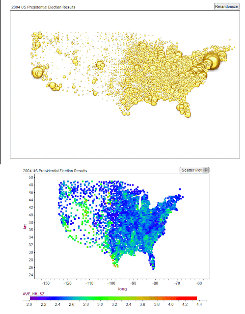
I spent some happy time after the 2004 election gathering data, by county, in a Fathom document. I was inspired by some fascinating articles with incredible data visualizations:
The changing colors of America (1960-2004)
Maps of the 2016 US presidential election results (it used to be 2004)
and posed a few questions on The Math Forum.
Fathom is licensed by the Ontario Ministry of Education for use in its publicly funded schools and Ontario has an innovative Data Management course at the Grade 12 level.
Here are two of the plots that I created in Fathom which I also think are very cool - not quite as fancy as the ones above however. These make you wonder where "middle America" has gone...

The comments related to the collection are worth a read.
I spent some happy time after the 2004 election gathering data, by county, in a Fathom document. I was inspired by some fascinating articles with incredible data visualizations:
The changing colors of America (1960-2004)
Maps of the 2016 US presidential election results (it used to be 2004)
and posed a few questions on The Math Forum.
Fathom is licensed by the Ontario Ministry of Education for use in its publicly funded schools and Ontario has an innovative Data Management course at the Grade 12 level.
Here are two of the plots that I created in Fathom which I also think are very cool - not quite as fancy as the ones above however. These make you wonder where "middle America" has gone...

The comments related to the collection are worth a read.
Subscribe to:
Comments (Atom)


