I spent some happy time after the 2004 election gathering data, by county, in a Fathom document. I was inspired by some fascinating articles with incredible data visualizations:
The changing colors of America (1960-2004)
Maps of the 2016 US presidential election results (it used to be 2004)
and posed a few questions on The Math Forum.
Fathom is licensed by the Ontario Ministry of Education for use in its publicly funded schools and Ontario has an innovative Data Management course at the Grade 12 level.
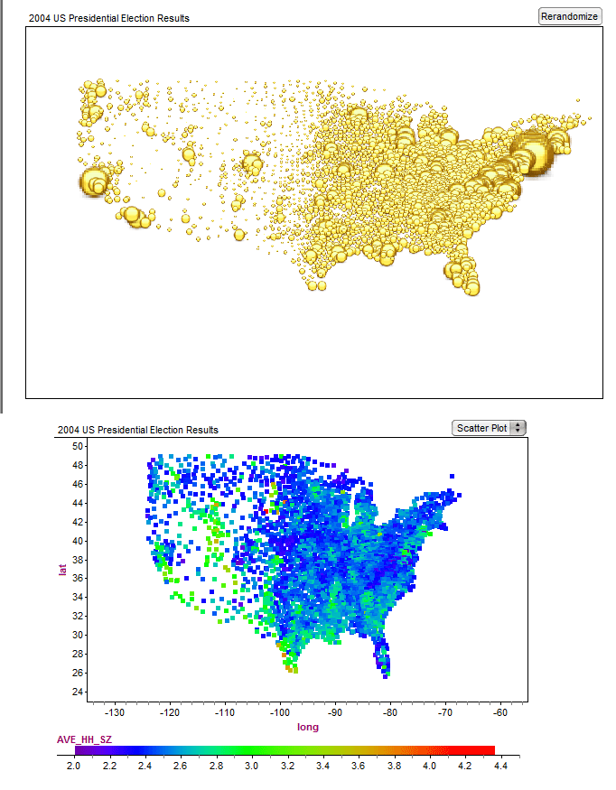
Here are two of the plots that I created in Fathom which I also think are very cool - not quite as fancy as the ones above however. These make you wonder where "middle America" has gone...
The comments related to the collection are worth a read.